TABLE OF CONTENTS
Overview
The Performance tab allows you to understand the accuracy of the forecast over time as measured by a range of metrics including MAPE, WAPE and Bias. Compare the accuracy of the Locked forecast and the original QU forecast based on actual Sales for the period.
Navigating to the performance tab
The Performance tab is the 2nd from the right.

Performance tab filter and display
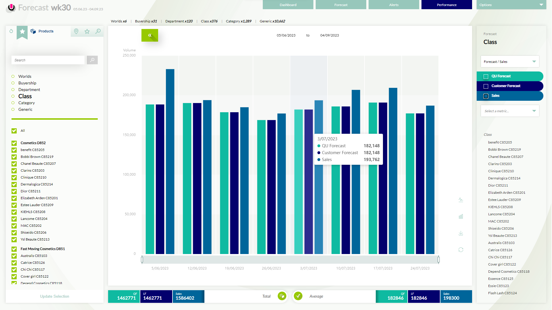
The performance tab has 2 combo boxes on the right panel to make selections to display comparisons as graphs or line chart views. As displayed, the combo box on the top right is to make a selection of "Forecast" and the second combo box is; the "Metric" combo" box.
Forecast combo box
There are three metrics to select from and display on the graph to compare performance.
- QU AI forecast
- Customer forecast
- Sales
The performance tab panel on the right will reflect all the above three metrics. All the metrics on the legend can be selected and deselected simultaneously. The hover tooltip displays information about everything shown in the graph below.
Metric Combo box
As displayed in the snip below, the user can select a metric from the; "Metric" combo box in the legend. In the performance tab, the below dropdown has MAPE and WAPE, metrics to make the forecast performance comparison.
When "None" is selected in the combo list, the placeholder text "Select a metric" is displayed in the combo box.

If any metric is selected from the metric combo box, the metrics focus on the sales/forecast view. Forecast sales bars drop to the back, and WAPE (in the below instance) come to the forefront. The summary panel at the bottom describe WAPE minimum, maximum and average totals. The graph axis will change accordingly.

Any action taken by the user in the non-focused section will switch the focus to that section. i.e. User looking at WAPE decides to hide the Locked forecast to reduce the business of the view. As the user toggles off the Locked forecast selection, the focus will be taken by the forecast/sales view, as shown below.

If the user clicks back on a label in the metric section; the focus of the screen is retaken by the WAPE information as highlighted in the image below. Hover Tooltip displays information about everything shown in the graph.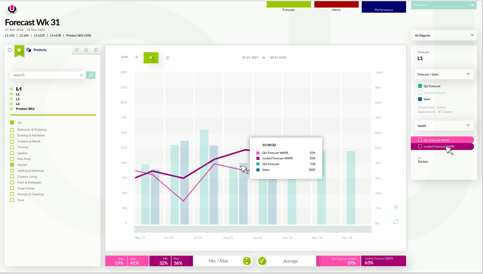
The hover tooltip displays information about everything shown in the graph. The user toggles off a metric in the WAPE view. Summary panels only display information about metrics visible in the graph for that section. The user toggles off all metrics in a section, and the summary panels display a "please select" message.


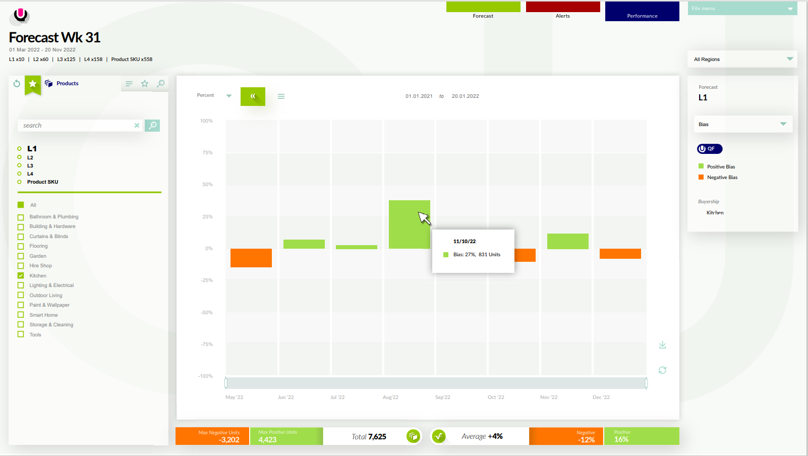
Bias Metric
QU AI Forecast
Bias displays the percentage of under and over-biasing of QF and LF forecast. QF is the default view and can be toggled to the LF by use of the switch on the legend. On a hover tooltip; it shows the date. Bias and the amount units that percentage equates to. The panel at the bottom shows the number of units over the forecast. The total is the sum of both. The average panel displays the average of negative, positive and the sum of both.
Customer Forecast
Bias displays the percentage of under and over-biasing of LF when the forecast selector is toggled. There is no need for any functionality of the legend bias labels, i.e no one will turn off one of the metrics.

Was this article helpful?
That’s Great!
Thank you for your feedback
Sorry! We couldn't be helpful
Thank you for your feedback
Feedback sent
We appreciate your effort and will try to fix the article