TABLE OF CONTENTS
Overview
In this article, you will learn about the different areas of the QU portal, and what functions various portal icons will perform.

The portal is split into 3 distinct sections:
- Navigation tabs
- Product filter
- Data table/Graph, Breadcrumb Navigation and Summary Panels
1. Navigation Tabs
Starting at the top right-hand corner are the Navigation tabs - this indicates the type of information you will see within the table. The forecast tab is the default table view.

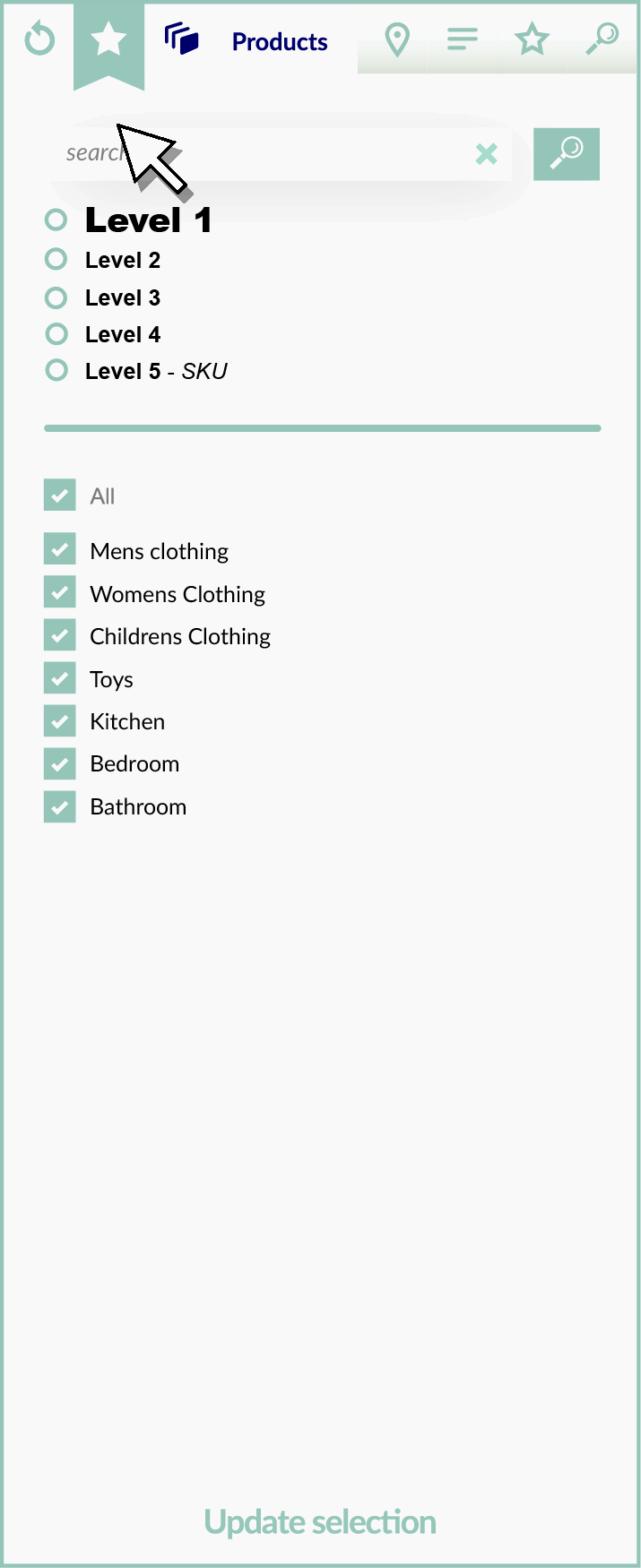
2. Product Filter
The Product Filter section has seven areas of functionality.
From left to right:
- Reset Button
Sets all levels and all tabs of the filter back to default (all on) - Save Favorite (star) Banner
Save whatever selections you have made in the filter so you can load it again using the Favorites tab. - Products
The left-hand panel is the product filter. Products are selected from a hierarchical filter.
- Regions
View all of the favorited selections by clicking the Favourites tab. - Attributes
Attributes of products are listed here, enabling micro-filtering of product groups - Favorites
View all of the favorited selections by clicking the Favourites tab. - Search
The Search tab will allow you to see search results for products by using keywords. You can search on any tab in the filter.
3. Breadcrumb navigation
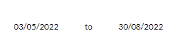
Name your forecast selection at the top left of the screen. After the name is the date range and below the date range is the product hierarchy breadcrumbs. This shows you have many lines are selected in each hierarchy level. Use the Breadcrumb to navigate up and down the hierarchy when the Product filter is hidden.

3. Data Table
The Data table comprises both the data itself, the display options and the summary panels. The data table is displayed in the centre of the screen displaying any products selected in the product filter.

- The data
The left-hand side of the table in the blue columns shows the historical data
The right-hand side of the table in the green columns shows the forecasted data
.
The dashed column dividing lines are separated by weeks with the week beginning date as the column heading. - Display options
The arrows will expand and collapse the product filter panel to give me screen real estate for the table data.
Show different types of information in the data grid by clicking on the Advanced Options button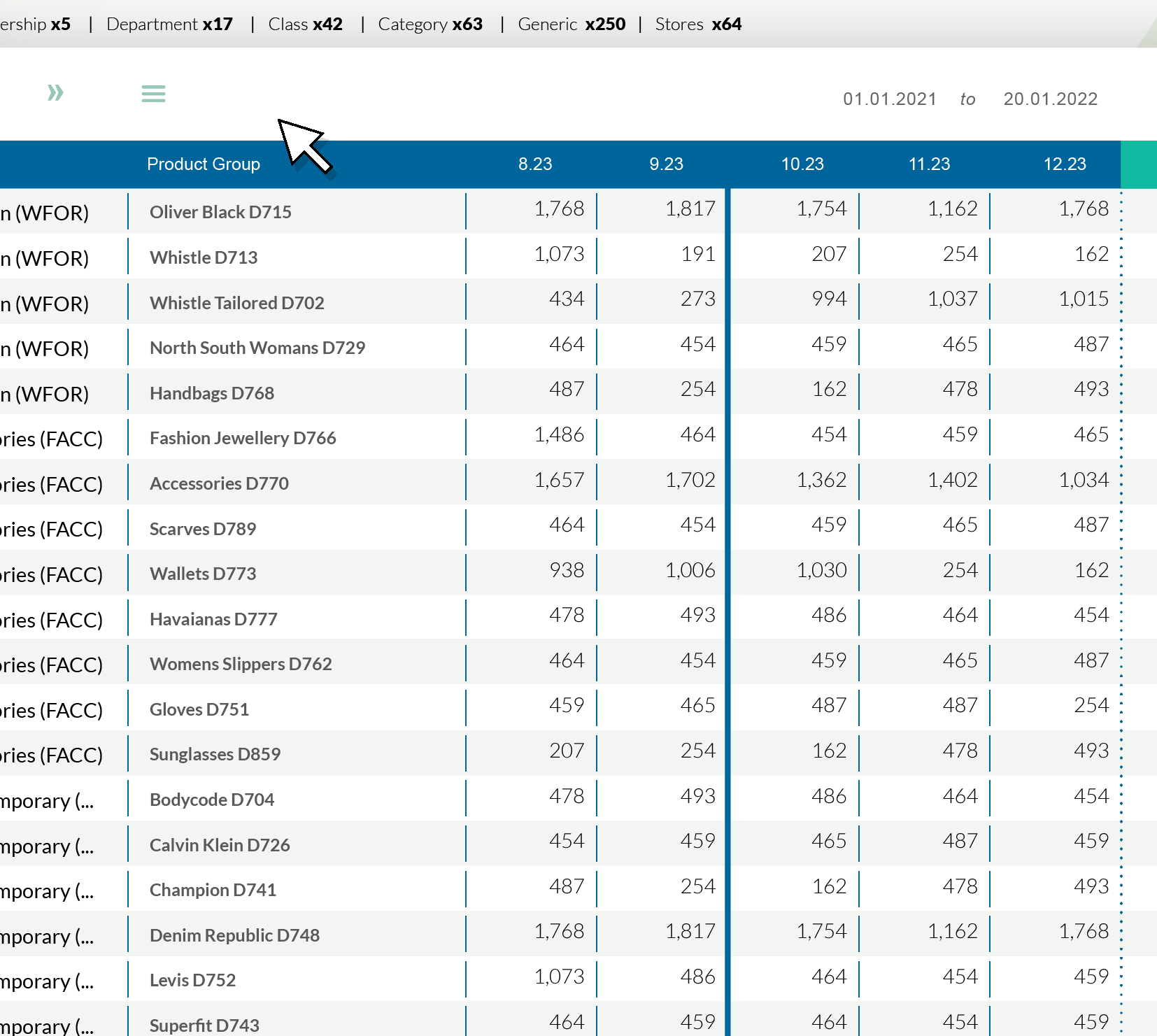
- The date range can be adjusted
Display the data graphically with the graph icon.
Download the current table contents as a .csv
4. Summary Panels
On selection of one or more cells on the data table in the History or Forecast sections, the summary panels will report the Overall total, and the composite History and Forecast totals of all cells selected.
On the right-hand side, the panels will report the average of all cells selected and the average of all History cells plus the average of all the Forecast cells selected.

Was this article helpful?
That’s Great!
Thank you for your feedback
Sorry! We couldn't be helpful
Thank you for your feedback
Feedback sent
We appreciate your effort and will try to fix the article