TABLE OF CONTENTS
- Overview
- Navigating the Chart
- Displaying more items on the chart
- Amending values in the Chart
- Date Slider
- Exporting the Chart
Overview
This article will demonstrate how to read and adjust the data in the Data Table.
Navigating the Chart
Toggle the Chart display on with the Graph icon

The chart will display 5 of the items selected in the product filter regardless of how many items are selected, by default. This is to make the chart clean and easy to read. The right-hand panel shows the corresponding product line colour representations.

The solid lines to the left-hand side depicts historical data.

The dotted lines depicts forecasted data.

The graph will span the time that is displayed in the display options bar
.

Displaying more items on the chart
Any items selected in the Product Filter will be available to be selected in the right-hand panel.
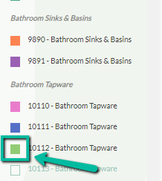
Click on the check box beside an item to view it on the Chart
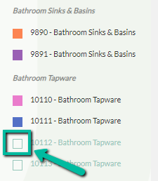
The colour in the checked box will correspond with the line colour on the Chart.
Conversely, the item can be omitted from the Chart by clicking on the checked box.
Amending values in the Chart
Any item can be selected in two ways:
- Click on the text label displayed on the right-hand panel
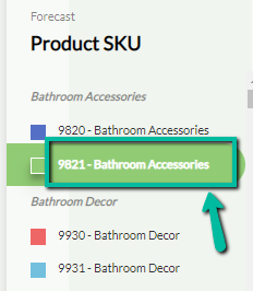
- Click on the line on the chart
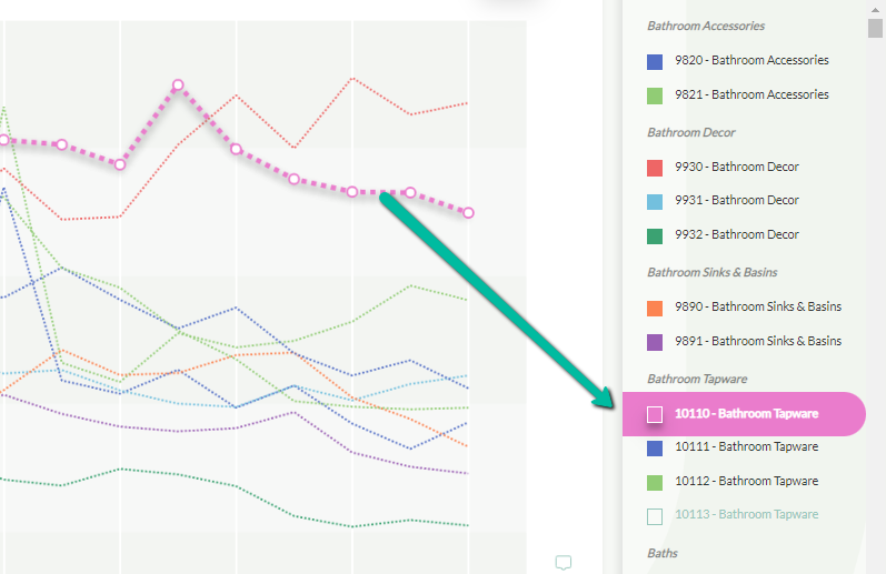
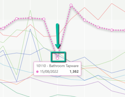
Hover over any data point to see the details
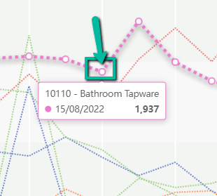
To adjust:
- Click the data point
- Drag the data point to the correct value
- Release the mouse click
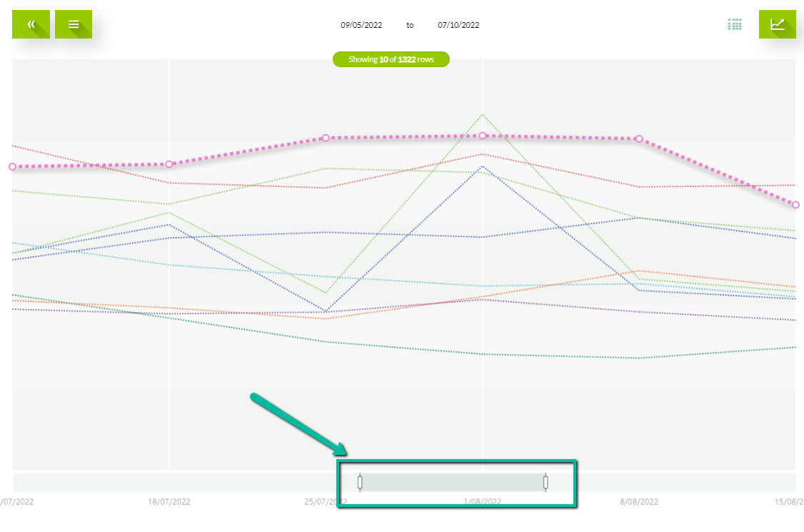
Date Slider
The graph can be zoomed in and out with the date slider, without changing the date range in the display options.
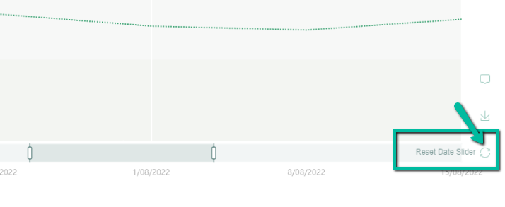
Reset the date slider by clicking the reset icon.
Exporting the Chart
Export a chart picture by selecting the download icon at the bottom right of the Chart.

Was this article helpful?
That’s Great!
Thank you for your feedback
Sorry! We couldn't be helpful
Thank you for your feedback
Feedback sent
We appreciate your effort and will try to fix the article